mitra co.
brand basics
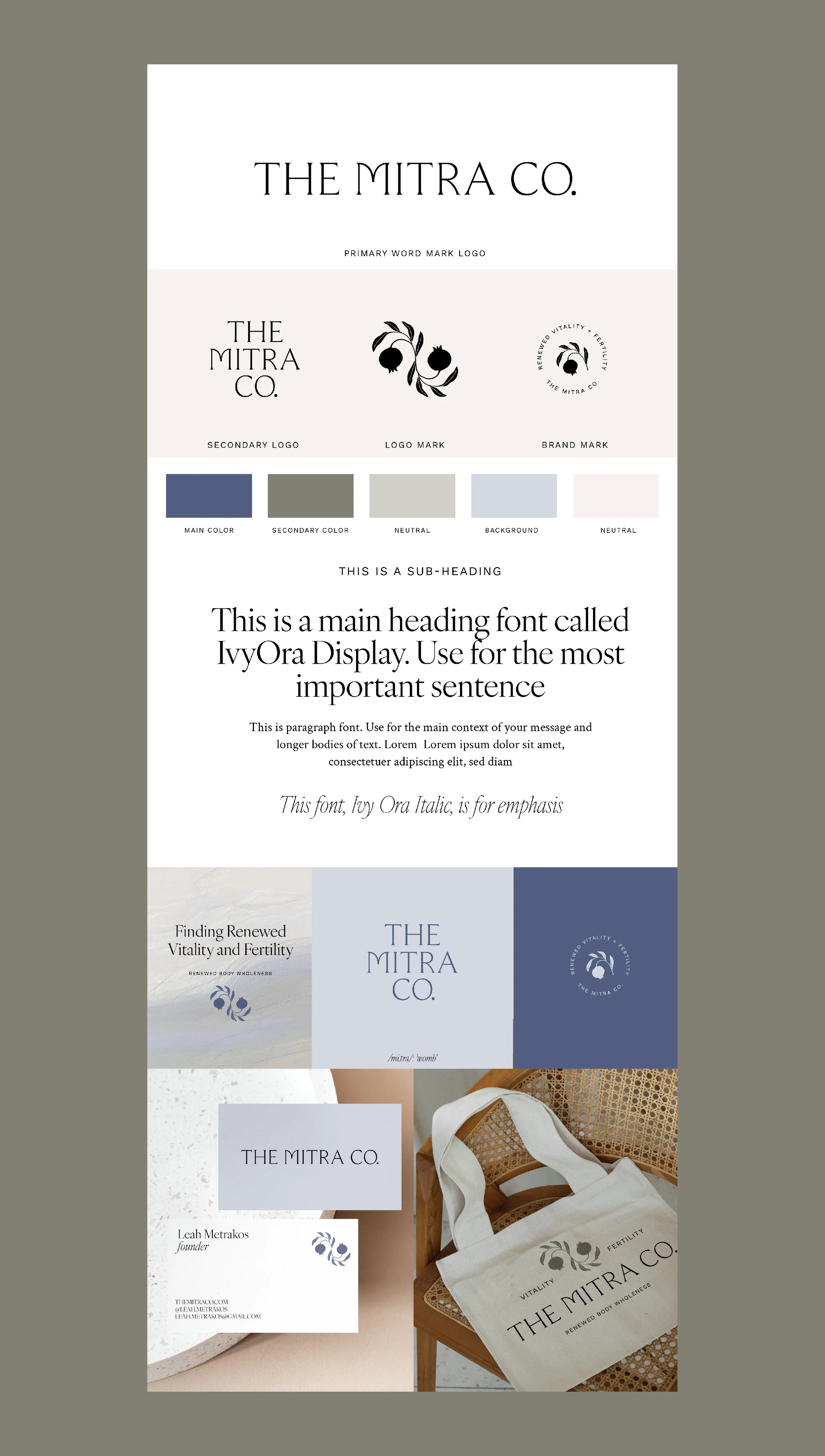
The Mitra Collective’s brand identity blends elegance with symbolism, creating a refined yet approachable presence. The primary logo features an authoritative serif with curved customizations that soften its angular feel and balance structure with warmth. Paired with a hand-drawn pomegranate logomark that symbolizes fertility and connection, the brand creates a natural flow between formality and organic movement. This identity is designed to feel timeless and meaningful while remaining versatile across digital and print applications.


