Reviv motherhood
brand + web
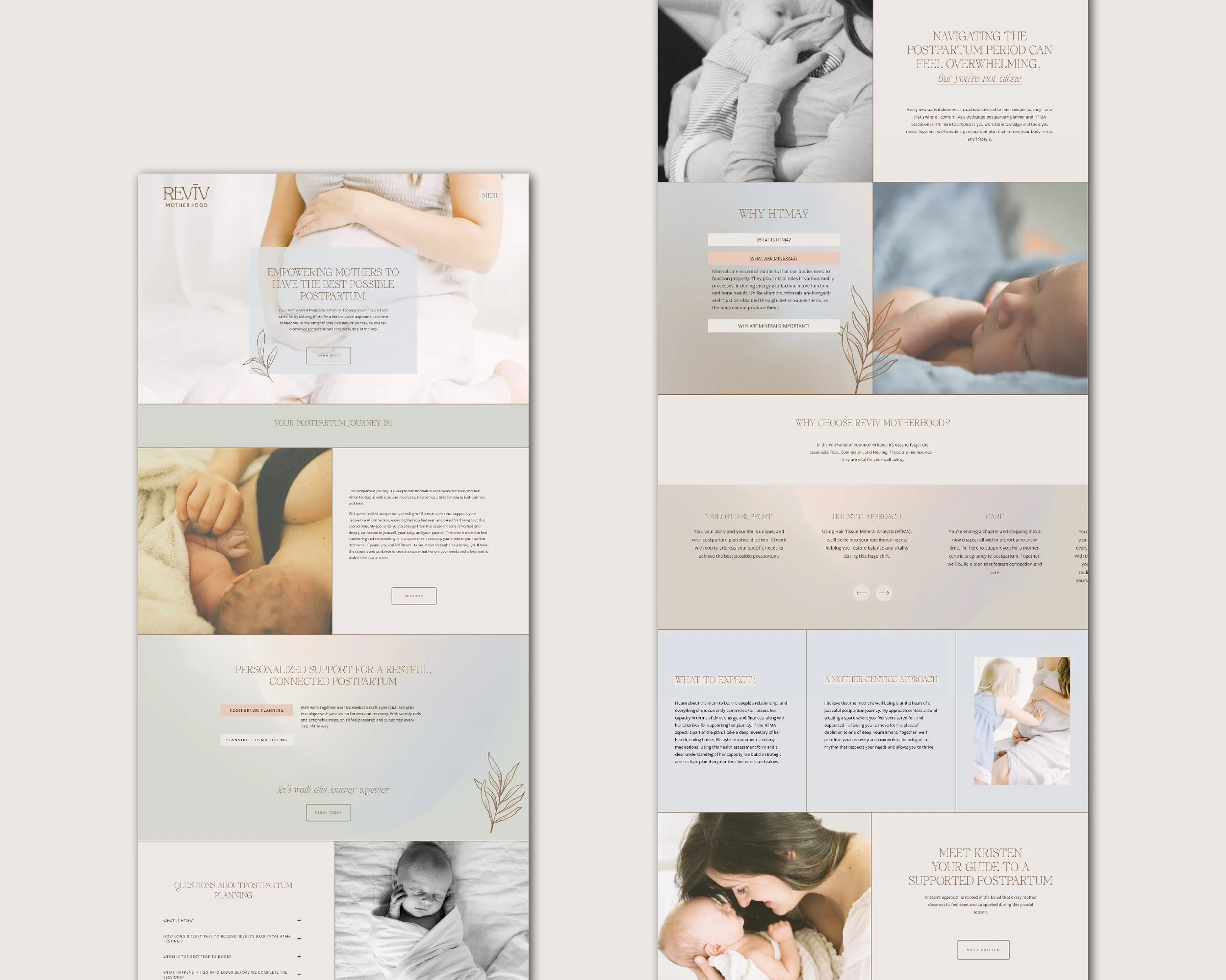
Revīv Motherhood’s brand identity is designed to feel soft, nurturing, and deeply intentional, reflecting the sacred nature of the postpartum journey. The primary logo features a refined serif with gentle customizations, creating warmth and ease while maintaining a strong foundation. A hand-drawn botanical element symbolizes restoration and the natural rhythms of healing. The website application carries this feeling through soft, muted colors, organic shapes, and a clean layout that guides mothers with clarity and calm. Thoughtful typography and warm imagery create a sense of rest, recovery, and connection at every touchpoint.


